How to Write Cursive Q — Uppercase & Lowercase Guide
Why does cursive Q look like a 2? Step-by-step uppercase and lowercase Q, style comparisons, and a free practice worksheet.
The cursive Q is one of the most searched letters on handwriting sites — and for good reason. Uppercase cursive Q looks like the number 2, lowercase q resembles a g with a descender, and both shapes confuse beginners who expect Q to look like print Q with a tail.
This guide explains why the letter looks the way it does, then walks you through both forms stroke by stroke. If you want the fast single-letter reference with animated stroke order, font previews, and an on-page printable worksheet, open the Cursive Q uppercase and lowercase guide.
The Cursive Q Looks Like a 2 — Here's Why
In traditional American cursive (D'Nealian and Zaner-Bloser styles), uppercase Q is drawn as:
- A large oval (similar to uppercase O)
- A diagonal tail that crosses through the oval and ends below the baseline
When the oval is written quickly, the tail dominates the shape — and the result looks like a 2 sitting on the line. That is normal. Teachers often remind students: "Q is the letter that looks like 2."
Lowercase q is a different problem: it uses a descender (the stroke drops below the baseline) like g or y, which makes it easy to confuse with lowercase g if the loop is closed too tightly.

Step-by-Step: Drawing Cursive Q (Uppercase)
- Start at the top of the oval — slightly above the midline on the left
- Draw a counterclockwise oval — round and open on the right side
- From the center-right of the oval, pull a diagonal stroke down and to the right
- Hook the tail at the baseline so it finishes with a slight curve upward
Tips:
- Keep the oval wide enough that the tail does not crush it
- The tail should cross the oval cleanly — not float outside it
- Practice on lined paper so the baseline keeps your Q consistent
Preview uppercase Q in multiple fonts using our cursive letter generator — select Q and compare styles instantly.
Step-by-Step: Drawing Cursive q (Lowercase)
- Start with a short upstroke from the baseline
- Form a rounded hump (like n) at the midline
- Drop a descender below the baseline in a smooth curve
- Finish with a small hook that curves back toward the right — this is your connector to the next letter
Common mistake: closing the descender loop too early, which makes q look like g. Leave the descender open until the hook completes.
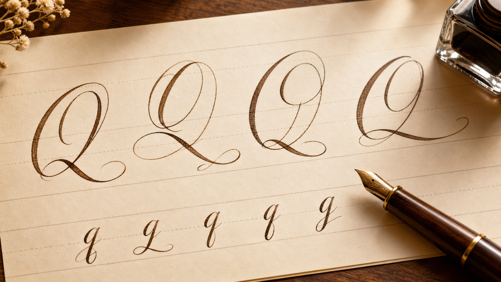
Cursive Q in 5 Different Styles
Not every cursive font draws Q the same way. Formal calligraphy Q may have a flourished tail; casual handwriting Q may simplify the oval entirely.

Type the letter Q in our cursive font generator to see 20+ real script previews and download PNG or SVG references. For a Q-only comparison, use the Cursive Q font preview section.
For a side-by-side uppercase and lowercase chart, visit the cursive alphabet generator.
Practice: Print a Cursive Q Worksheet
The fastest way to fix a confusing letter is traced repetition:
Print a Cursive Q Worksheet
Enter Q or any Q-word (Queen, Quick, Quiet) and download a printable trace worksheet. Free, no account needed.
Open free tool →You can also use the embedded worksheet on the printable cursive Q practice page, or open the worksheet generator with full words starting with Q to practice connections, not just the isolated letter.
Words That Start with Q
Once the letter shape feels natural, practice it inside words:
- Queen — tests uppercase Q as a word starter
- Quick — connects q to u and i
- Quiet — longer word with multiple connections
- Quest — good for tail and loop spacing
Type any of these in the cursive word generator to preview how they look in elegant, casual, and bold script fonts before writing by hand.
Frequently Asked Questions
Why does cursive Q look like 2?
The diagonal tail dominates the oval when written in one motion. Historically, American cursive styles emphasized a fast connected stroke — the tail became the most visible part of the letter.
Is uppercase Q or lowercase q harder?
Most beginners find uppercase Q harder because of the oval-plus-tail combination. Lowercase q is easier once you distinguish it from g.
How do I write cursive Q without it looking like 2?
Make the oval larger and more circular. A bigger oval gives the tail context so the full Q shape reads clearly.
Can I use a cursive Q in a tattoo?
Yes — generate a reference in our cursive tattoo generator, then ask your artist to adjust stroke weight for skin placement.
Where can I learn the other hard letters?
Read our cursive capital letters guide for Q, Z, G, and F — or the full how to write in cursive beginner tutorial.
For the focused Q reference page, use the Cursive Q uppercase, lowercase, animated stroke order, and printable worksheet guide.
Related Tools & Guides
- Cursive Alphabet Chart — all 26 letters
- How to Write in Cursive — complete beginner guide
- Cursive Writing Practice — sentence-level practice